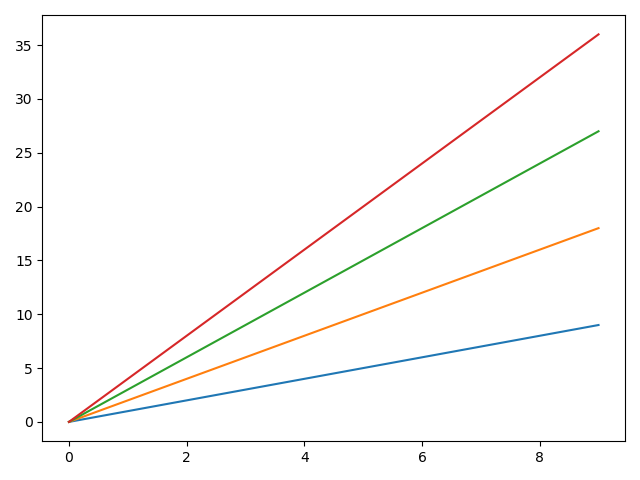
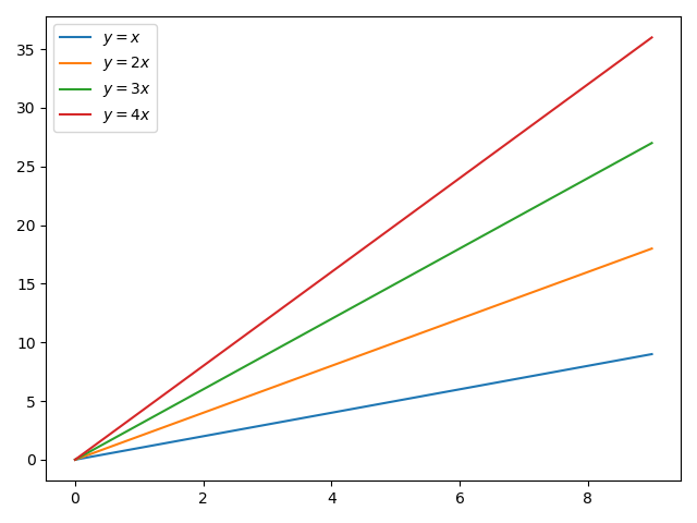
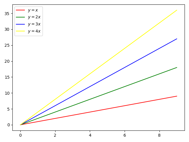
import numpy as np import matplotlib.pyplot as plt
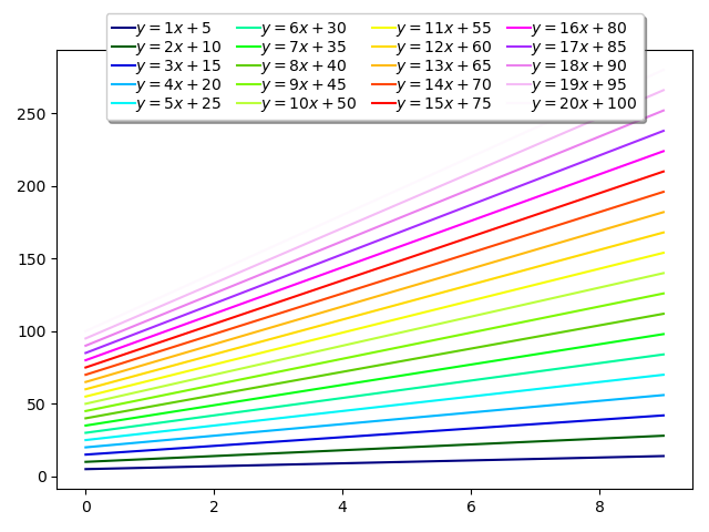
num_plots = 20
# Have a look at the colormaps here and decide which one you'd like: # https://matplotlib.org/3.1.3/gallery/color/colormap_reference.html#sphx-glr-gallery-color-colormap-reference-py plt.gca().set_prop_cycle( plt.cycler('color', plt.cm.get_cmap('gist_ncar')(np.linspace(0, 1, num_plots))))
# Plot several different functions... x = np.arange(10) for i inrange(1, num_plots + 1): plt.plot(x, i * x + 5 * i, label=f'$y = {i}x + {5 * i}$')
# I'm basically just demonstrating several different legend options here... plt.legend(ncol=4, loc='upper center', bbox_to_anchor=[0.5, 1.1], columnspacing=1.0, labelspacing=0.0, handletextpad=0.0, handlelength=1.5, fancybox=True, shadow=True)
plt.show()
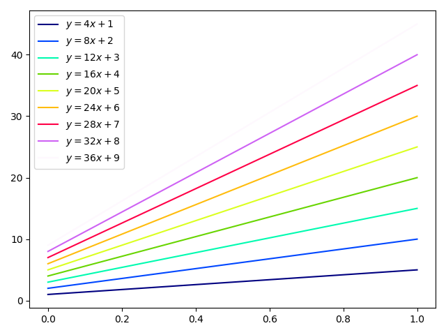
如果你事先不知道要绘制的线条数量,可以在绘制它们之后从图形中获取曲线数量并更改颜色:
1 2 3 4 5 6 7 8 9 10 11 12 13
import numpy as np import matplotlib.pyplot as plt
for i inrange(1, 10): plt.plot(np.array([1, 5]) * i, label=f'$y = {4 * i}x + {i}$')
colormap = plt.cm.get_cmap('gist_ncar') colors = [colormap(i) for i in np.linspace(0, 1, len(plt.gca().lines))] for i, j inenumerate(plt.gca().lines): j.set_color(colors[i])